👉🖥️ Bastion Excel Terminal
The core idea behind the terminal is to create a set of infographics that clearly show a company's key financial trends and how well it fits various investment strategies, without the need to read full financial reports.
What if you could look at a company and, in 30 seconds, answer:
What kind of business is this?
Is it growing or shrinking?
Is it cheap or expensive?
I built a file with key dashboards designed to give you immediate clarity. Here is a brief overview of the main infographics available in Stock Dashboards and their purposes.
1. GEAR+ Tab — Growth + Efficiency at a Reasonable Price
This is the main dashboard and my default starting point.
It gives you a visual snapshot of:
Revenue trends
Profitability
Valuation
And an overall Strategy Fit Score
That score is based on where the company ranks (from 1 to 10) across 7 key factors relative to 3,000 global companies:
Historical revenue growth
Forecasted revenue growth
Forward P/E (12 months)
Forward P/E (3 years out)
Operating margin (LTM)
1-year stock performance
The higher the score, the better the company fits the GEAR strategy.
But a low score doesn't mean the company is “bad” — it just means it's not aligned with this particular strategy.
Default threshold ratings:
Score ≥ 60 → BUY candidate
50–60 → HOLD
< 50 → SELL
I use this tab to quickly assess whether a company fits my portfolio's goals.
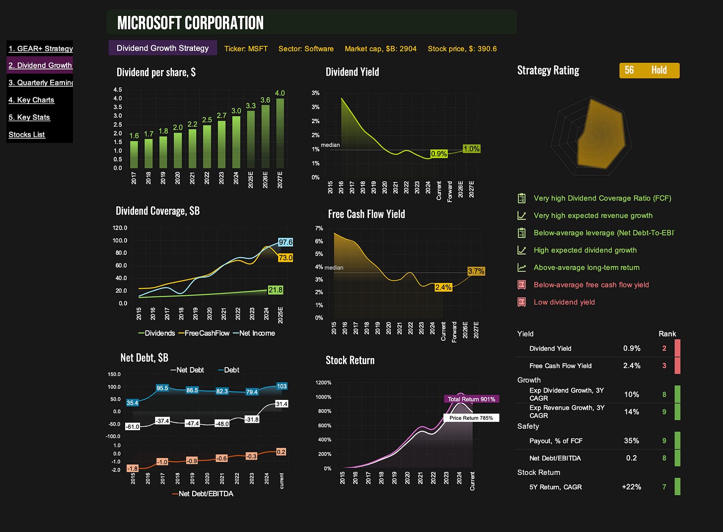
2. Dividend Tab — Dividend Growth Strategy
Same concept but with a dividend-focused lens.
This tab evaluates companies based on:
Dividend yield
Free cash flow yield
Dividend growth forecast (3 years)
Revenue growth forecast (3 years)
Payout ratio (as % of FCF)
Net Debt / EBITDA
5-year average total return
The goal is to find high-quality dividend payers that can sustainably grow those payouts.
3. Quarterly Tab — Latest Financials at a Glance
Use this dashboard to stay up to date with recent results:
Revenue
EBITDA
Net income
Operating & free cash flow
Debt and cash levels
Margins
After each earnings season, I use this dashboard to review all the market leaders and quickly identify the key trends in their businesses.
4. Key Charts — 16 Visual Trends
This is the big-picture tab — 16 charts covering long-term trends in:
Financials
Margins
Valuation
Stock performance
All in one place, no clicking around. Great for getting a feel for where the company has been and where it might be going.
5. Key Stats — 30+ Core Metrics
Here, you’ll find more than 30 metrics, including:
Growth forecasts
Valuation multiples
Yield & return metrics
Efficiency & profitability
Every metric is also scored from 0 to 10 based on its percentile vs. global peers.
For example:
A 10 in "Revenue Growth Forecast" means the company is in the top 10% globally.
This lets you instantly spot a company’s defining traits — where it excels and where it lags.
You’ll also see a “Best for Strategies” block with factor-based ratings:
Factor Strategies:
Growth
Quality
Deep Value
Buy the Dip
Stock Momentum
Multi-Factor Strategies:
FOMO Momentum
Deep Value + Momentum
Efficiency + Growth
GEAR (Growth + Efficiency at Reasonable Price)
Dividend Growth
Again, these scores don’t tell you if the company is "good" — just whether it aligns with a specific strategy or style. Each strategy will be described in more detail in a separate guide.
6. Stocks List — All Covered Companies
This tab shows you the whole universe of stocks available in the terminal:
~500 U.S. companies
~100 international names (and growing)
You can search by typing a ticker or company name, or scroll manually in cell G11 on the GEAR+ tab.
If you want access to these dashboards, subscribe below.
Other Guides:


