
58 Fundamental Metrics I Use for Stock Analysis + Excel Template
A complete framework covering growth, profitability, valuation, leverage, efficiency, and more.

My goal is to make company analysis as simple and visual as possible. With just one glance at an infographic dashboard, you can quickly see:
what kind of business it is,
its main strengths and weaknesses,
and which investment strategies it fits best.
To create this system, I selected 58+ key fundamental metrics I find most relevant today. The list keeps growing as I add new strategy ideas.
Below is a full dashboard example for Microsoft, showing all the metrics in my scoring system.

You can find this dashboard in 🖥️The Terminal:
📂 Stock Dashboards (Tab 6: AllStats) – covers ~500 top U.S. companies and ~50 major global ones.
📂 Strategy Builder (Tab 3: AllStats) – with data on ~3,500 global companies.
⏰ I update both dashboards weekly and publish them on the site.
👇 Below, I’ve included a sample version of this dashboard for 3,500 stocks from the Bastion Stocks Universe. Feel free to explore and see how it works.
Here's what the dashboard shows:
1. Investment Metrics Grouped by Factor Categories
Indicators are grouped into categories such as Growth, Quality, Value, and others. Each metric is scored on a scale from 1 to 10, based on how the company ranks globally:
🟩 Scores of 7–10 indicate the company ranks in the top 10–40% of global peers for that metric.
🟨 Scores of 4–6 suggest the company is around the global average.
🟥 Scores of 1–3 mean the company ranks in the bottom 10–30% globally.
This scoring system allows for a quick visual assessment of the company’s strengths and weaknesses across fundamental dimensions.
Note: A low or high score doesn’t mean the company is good or bad. It simply reflects its standing relative to other companies in the investment universe for each factor.
2. Strategy / Factor Scores
This section shows how well the company fits into different investment strategies. These strategy scores are derived from the underlying factor ratings. You can find more on the methodology in the article linked below.

3. Top / Bottom Metric Zone
This part of the dashboard highlights the company’s strongest and weakest metrics. Useful for fast diagnostics and deeper due diligence.
📡 About the Data and Forecasts
All dashboard metrics are based on a blend of public and third-party data. I use a custom-built algorithm to clean, standardize, and unify this data. It allows for:
automatic calculation of fundamentals in USD,
averaging of analyst forecasts,
consistent company scoring across metrics.
The forecast figures (like projected revenue or EPS growth over 1–5 years) are my own estimates, based on analysis across multiple sources. They are generally close to Wall Street consensus but not official.
Forecasts are never exact, but even rough forward estimates can offer meaningful insights into a company's potential.
Next, we’ll break down the specific factors in more detail, using Microsoft as an example.
📈 Growth
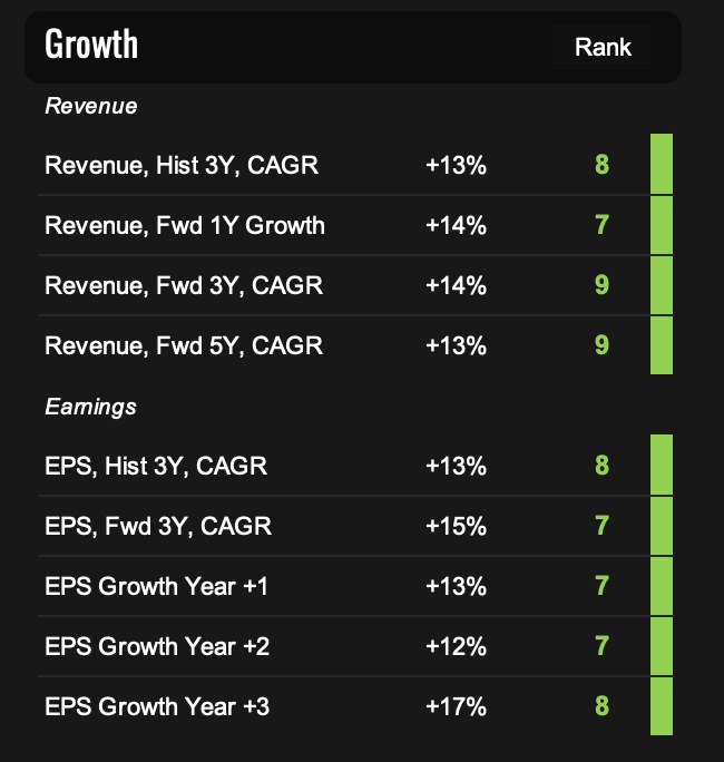
What they measure: This group of factors evaluates both historical and projected growth in revenue and earnings per share (EPS). This section helps you quickly determine if a company is a growth story or a stagnating business.
Why it matters: Sustained growth in sales and profits is a key driver of long-term shareholder returns. High-growth companies typically attract higher valuations and outperform over time—especially when growth is both strong and consistent.
Explanation of the metrics:
1–4. Revenue Growth
Hist 3Y CAGR — the compound annual revenue growth rate over the past three years. This shows how the business has actually performed.
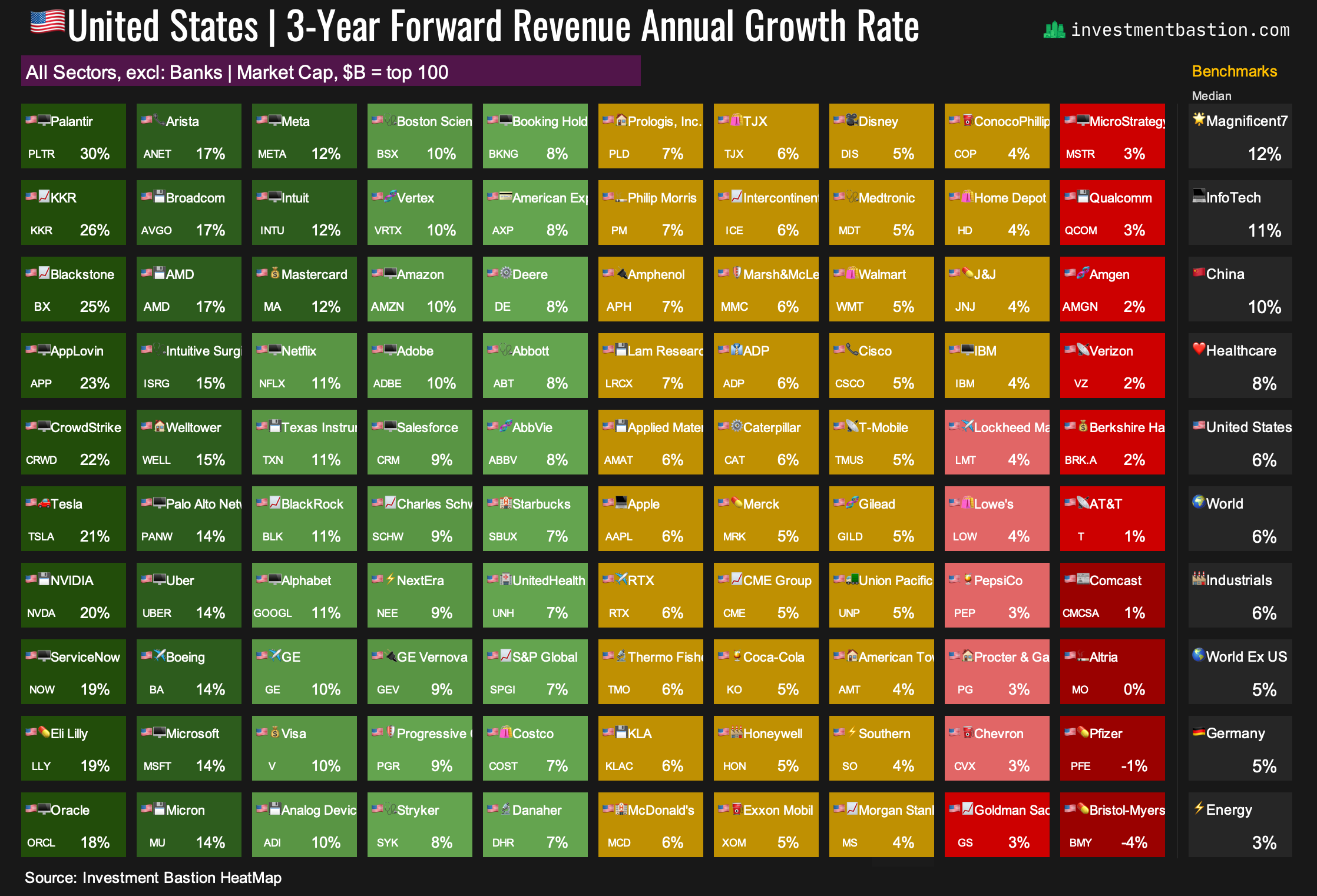
Fwd 1Y, 3Y, 5Y CAGR — forward-looking revenue growth projections for the next 1, 3, and 5 years.
📌 For Microsoft:
Expected revenue growth is around +13–14% annually, both historically and in forward estimates. Score: 7–9 out of 10. An exceptionally strong and stable pace for a company of its size.
➡️ Projected 3-year revenue growth for the top 100 US stocks.
Important: Revenue alone isn’t always a reliable indicator of true fundamental growth. A company might sell off unprofitable units, or conversely, inflate revenue through acquisitions.
That’s why it’s crucial to also consider earnings, especially earnings per share (EPS), to get a more accurate picture.
5–9. Earnings per Share Growth (EPS Growth)
Explanation of metrics:
Hist 3Y CAGR — actual EPS growth over the last 3 years.
Fwd 3Y CAGR and year-by-year EPS projections (Year 1, 2, and 3) factor in both net income and the impact of share buybacks.
One important rule in my system:
If a company transitions from losses to profits, it receives a score of 10 for EPS Growth.
If it moves from profits to losses, the score is 0.
📌 For Microsoft: EPS is growing at around +13–17% per year, both historically and in forward estimates. A strong performance for a company of this scale. This explains its high scores in Growth and Quality + Growth strategies.
➡️ Expected 3-year EPS growth for the top US stocks.

10–13. 💸 Dividend Growth

What it measures: This block of metrics tracks the growth and stability of dividend payments. These metrics are especially relevant for investors focused on passive income or dividend growth strategies.
Why it matters: Companies that consistently raise dividends while maintaining moderate payout levels typically have stable cash flows and a mature and resilient business model. Firms with sustainable dividend growth tend to show lower volatility and better long-term returns than high-yield but unstable "dividend traps."
Explanation of the metrics:
3Y DPS Growth Rate, Hist — actual compound annual growth rate of dividends over the past 3 years.
3Y DPS Growth Rate, Exp — expected compound annual dividend growth in the coming years.
Payout as % of Free Cash Flow — the share of free cash flow distributed as dividends. Payout ratios below 50% are generally considered sustainable.
Payout as % of Net Income — the share of accounting profit paid out to shareholders.
Note: The payout ratio based on net income shows how much of a company’s reported profit is returned to shareholders. But accounting profit can differ significantly from actual cash flow.
That’s why I also look at the payout from free cash flow (FCF) — it gives a clearer picture of whether the company has real money to support and grow dividends.
By comparing both, we get a sense of the margin of safety a company has to maintain or increase its dividends over time.
📌 For Microsoft: Both historical and expected dividend growth hover around +10% annually. It’s a solid pace for a mega-cap company. At the same time, the payout ratios are low: just 26% of net income and 36% of free cash flow, indicating strong dividend stability and ample room for future increases. Score: 7–9 out of 10.
➡️ 3-year Dividend growth rate for the top 100 US stocks.

🏆 Quality

What it measures: This group of factors reflects a company’s profitability, earnings stability, and overall financial resilience.
Why it matters: High-quality companies tend to show strong resilience during downturns, make more efficient use of capital, and are often able to generate profits and free cash flow regardless of the broader economic cycle.
14–20. Margins
Explanation of metrics:
EBITDA Margin, EBIT Margin, Net Income Margin — These metrics show what portion of revenue remains before and after depreciation, interest, and taxes. High margins often point to competitive advantages (moats) and are strong indicators of a high-quality business.
Forward Margins (FY+3) — Projected margin three years ahead. This helps assess long-term efficiency. A company may be unprofitable today due to heavy investment in growth. What matters is whether future margins are expected to improve, especially when analyzing growth stocks.
Free Cash Flow Margin — The ratio of free cash flow to revenue.
This measures how effectively the company converts sales into actual cash.
If net income margins are positive but FCF margin is negative, it could mean the company is making heavy investments, or possibly manipulating accounting profits.
➡️ EBITDA Margin for the top US stocks.

📌 Microsoft’s margin profile is among the best in the market across all metrics.
Rule of 40 = Revenue Growth + EBITDA Margin
Originally used to evaluate software and tech companies, I apply this rule more broadly. If the sum exceeds 40%, it signals a healthy balance of growth and quality.
📌 For Microsoft: The Rule of 40 stands at 59% — an excellent figure.
➡️ Rule of 40 for the top US stocks.

21–24. Profitability
Explanation of metrics:
ROE (Return on Equity) = Net Income / Shareholders’ Equity
Measures how efficiently a company generates profits from shareholders’ capital.ROA (Return on Assets) = Net Income / Total Assets
Shows how well a company uses all its assets to generate earnings.ROCE (Return on Capital Employed) = EBIT / (Equity + Non-current Liabilities)
Particularly relevant for capital-intensive industries. It indicates how efficiently the company is using its invested capital.
Values above 20–25% are considered excellent.
📌 For Microsoft:
ROE: 34%, ROCE: 30%, ROA: 18% — all outstanding numbers that confirm the company’s top-tier business quality.
➡️ Return on Capital Employed for the top US stocks.

Earnings Stability Index
This is a custom indicator (scored from 0 to 10) that reflects how consistent and smooth a company’s earnings growth has been over time. I calculate this myself based on historical and projected EPS data.
It’s built as follows:
The company gets 0.5 points for each profitable year (from FY–3 through FY+1).
It receives an additional 1.5 points for each year in which EPS reached a new high over the prior 4 years.
The maximum score is 10, awarded to companies with stable and consistently rising earnings.
📌 Microsoft scores a perfect 10, reflecting its exceptional track record of earnings consistency.
💰 Value

What it measures: This block answers a key question: Is the stock expensive or cheap relative to the company’s earnings, cash flow, and revenue? It includes classic valuation multiples, comparisons to historical averages, and current shareholder yield.
Why it matters: Valuation is a core element of any investment strategy. Even a strong, growing business can become a poor investment if you're paying too much for each unit of profit. Extensive academic research has shown that, over the long run, low-multiple (value) stocks tend to deliver better risk-adjusted returns, all else being equal.
That said, for high-quality, fast-growing companies like Microsoft, premium valuations can be justified, especially when evaluated relative to their historical averages.
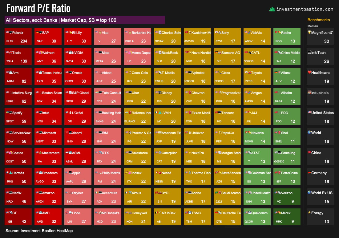
25–28. Price-based Multiples
Explanation of metrics:
P/E (Price to Earnings) — current, 12-month forward, and 3-year forward.
It's essential to evaluate P/E not just against historical levels, but also against future expectations. This helps avoid overlooking growth stocks that may appear expensive based on trailing earnings but are actually undervalued on a forward basis.P/BV (Price to Book Value) — particularly relevant for capital-intensive industries where book value reflects tangible assets.
However, in the case of companies like Microsoft, this ratio is often distorted due to a high share of intangible assets and large share buybacks that reduce book equity.
As the economy shifts toward tech, P/BV has become less relevant for many analysts and investors. However, it remains useful for sectors such as banking.
📌 For Microsoft: P/E ranges from 36.5 (LTM) to 26.9 (FY+3) — high numbers that result in low scores (2–3 out of 10). This suggests Microsoft is not a fit for Deep Value investors.
➡️ Forward P/E for the top 100 US stocks.
28–34. EV-based Multiples
Enterprise Value (EV)-based multiples assess a company’s valuation, including its debt and cash, representing the price to buy the entire business.
Explanation of metrics:
EV/EBITDA — how much you're paying for operating earnings before depreciation. One of the most widely used valuation metrics across sectors.
EV/EBIT — similar, but includes depreciation and amortization; more relevant for capital-heavy industries.
EV/Sales — how much investors pay for each dollar of revenue. Particularly important for growth companies with low or volatile earnings.
Each of these is shown based on trailing 12 months and forward projections to give a full picture.
📌 For Microsoft:
EV/EBITDA: 23–24x
EV/EBIT: around 28–29x
EV/Sales: above 13x
These are very high levels. As a result, Microsoft receives low scores (1–3 out of 10) across all EV-based valuation metrics.
However, for a fast-growing, highly efficient business, such valuations can be justified. If you’re running a growth-focused portfolio, these indicators may be less critical than for value-oriented strategies.
➡️ Forward EV/EBITDA for the top 100 US stocks.

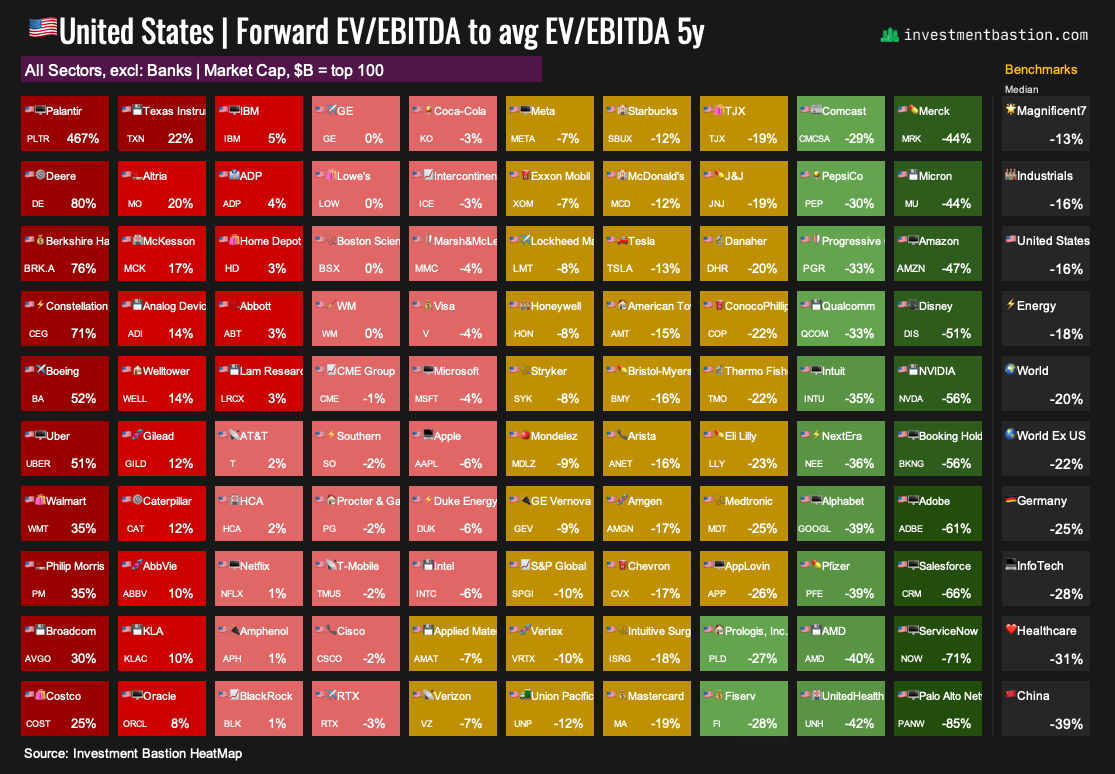
35–37. Comparison to Historical Averages
What it measures: This block compares a company’s current forward valuation multiples (P/E, EV/EBITDA, EV/Sales) to its 5-year historical averages. This is important because:
Some companies consistently trade at a premium due to their high quality, and that’s normal for them.
Comparing current valuation to the company’s “normal range” helps assess whether the market is overpaying today. A meaningful discount may signal a buying opportunity if the reason behind it is well understood.
📌 For Microsoft:
P/E is 2% below its 5-year average
EV/EBITDA is 4% below
EV/Sales is 9% above
This suggests that despite high absolute valuations, Microsoft’s current pricing is not extreme. It's generally in line with its historical norms. The deeper the discount (i.e., the more negative the percentage), the higher the score on this metric. Microsoft scores relatively low here because many global companies currently trade at much larger discounts to their historical multiples.
➡️ Forward EV/EBITDA to average 5y EV/EBITDA for the top 100 US stocks.
38–41. Yield
What it measures: A company’s return of capital to shareholders through dividends, share buybacks, or free cash flow relative to its market cap. These metrics help assess income potential, capital allocation discipline, and whether the stock may be undervalued based on cash-based returns.
Explanation of metrics:
Free Cash Flow (FCF) Yield — the amount of free cash flow generated relative to market capitalization. Reflects how much real cash the company earns per share.
Dividend Yield — the classic measure of dividend income as a percentage of share price.
Dividend Yield 2028 — projected dividend yield three years out.
Buyback Yield — the percentage of market cap spent on share repurchases. This is an alternative form of capital return to shareholders.
📌 For Microsoft:
FCF Yield: 2.0%
Dividend Yield: 0.7%
Buyback Yield: 0.5%
These levels reflect low current shareholder yield, which is typical for high-growth, high-valuation companies. Score: 1–3 out of 10, except for buybacks, where Microsoft scores a 7. Unlike Microsoft, most global companies spend far less on share buybacks. Even if a company’s Buyback Yield is below 1%, it may still receive a relatively high score, depending on the market context.
➡️ Dividend Yield for the top 100 US stocks.

42–44.🏦Leverage

What it measures: This section evaluates how much a company relies on borrowed capital and how well it can service its debt. It’s a key factor in assessing financial stability, bankruptcy risk, and business flexibility.
Why it matters: Highly leveraged companies are vulnerable in environments with rising interest rates, declining profits, or limited access to capital markets. In contrast, low leverage enables companies to weather downturns without raising additional funds, providing more flexibility for investments and share buybacks.
In many multifactor models (such as the Altman Z-Score, Piotroski F-Score, and Sloan Ratio), debt metrics are used as predictors of earnings stability and financial resilience.
Explanation of metrics:
Debt/Equity — shows how much debt the company has for every dollar of equity. A value below 1 indicates that the company is primarily funded through equity rather than debt.
Debt/EBITDA — measures how many years it would take to repay the debt using EBITDA. A value below 2.0 is considered low and healthy. If the ratio exceeds 5–6, it may indicate significant business risks.
Net Debt/EBITDA — focuses on net debt (total debt minus cash), offering a more accurate picture of the company’s debt burden.
📌 Microsoft has low leverage ratios, earning it scores in the 8–9 range. The company is extremely financially resilient and can grow revenue at double-digit rates without raising capital. These are outstanding indicators of strength and flexibility.
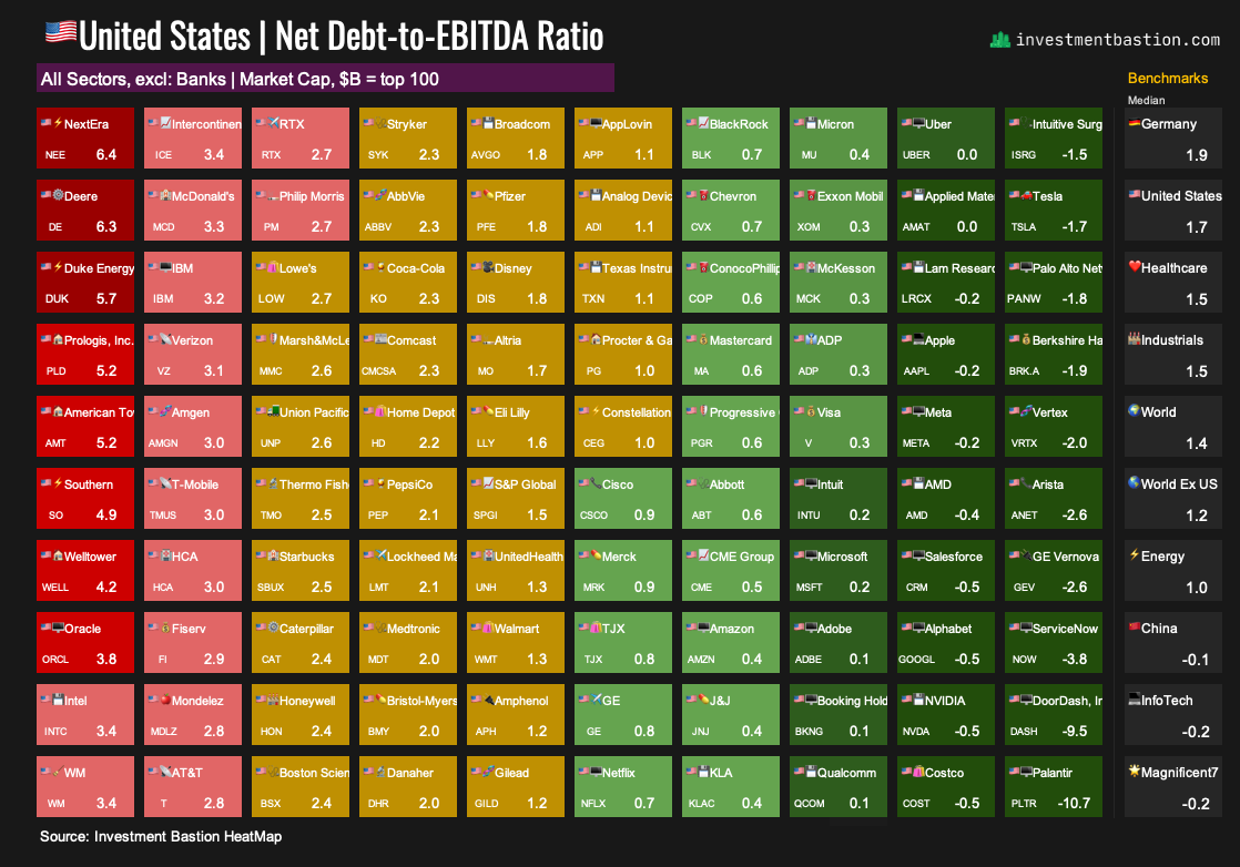
➡️ Net Debt/EBITDA for the top 100 US stocks.
45-53. 📈 Total Return

What it measures: This section shows the actual returns a stock has delivered over various time periods and reflects its current market strength and momentum. It’s a key element for both long-term investors and short-term or tactical strategies.
Why it matters: Historical performance indicates how effectively a company has created value for shareholders. Short-term price action and momentum help assess whether a stock is in a positive market trend, which is often a sign of strength, especially when supported by strong fundamentals. Academic research has shown that positive price momentum is one of the most consistent return factors in investment models.
Metrics:
Short-Term Returns
1 week
1 month
3 months
YTD (Year-to-date)
Long-Term Returns
1 year
3 years
5 years
10 years
Momentum – Market Strength
Price % of 52W High: Measures how close the current price is to its 52-week high (100% = at the high)
Price % of 52W Range: Measures the stock’s position within its 52-week price range
(Current Price – 52W Low) / (52W High – 52W Low))
📌 Microsoft consistently delivers long-term shareholder value and currently shows strong upward momentum. It remains an attractive trend-following opportunity for investors expecting the rally to continue.
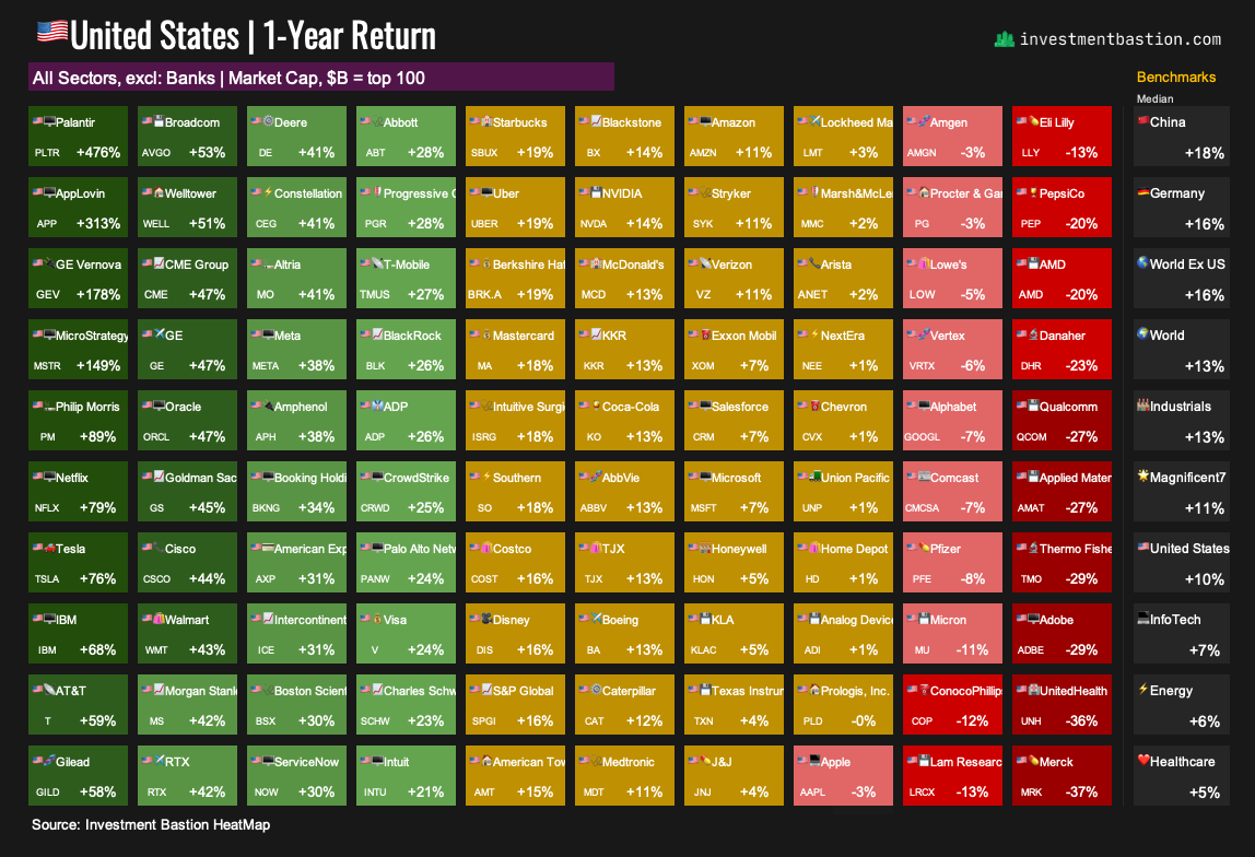
➡️ 1-year Return for the top 100 US stocks.
54–56. 🌪️ Volatility

What it measures: This section shows how much a stock’s price tends to fluctuate and how it moves in relation to the broader market. It helps assess whether the stock suits more conservative or more aggressive investment strategies.
Why it matters: Volatility is a key metric for evaluating the risk profile of an asset. More stable stocks are better suited for long-term or defensive strategies, while more volatile names appeal to active investors who are comfortable with sharp price swings.
Explanation of metrics:
Beta — measures the stock’s sensitivity to overall market movements. A beta of 1 means the stock tends to move in line with the market.
St Dev — annualized standard deviation of daily returns (based on 3-month data). Reflects the magnitude of price swings.
Volume Change (90D) — change in average daily trading volume over the past 90 days.
📌 Microsoft has a beta of exactly 1.0, indicating average market-level risk. The 33% standard deviation reflects moderate volatility for an equity. There are no unusual changes in trading volume. Overall, Microsoft exhibits a market-typical risk profile and remains relatively calm in terms of volatility.
➡️ Annualized standard deviation for the top 100 US stocks.

57–58. 🛠️ Fundamentals / Other Indicators

What it measures: This section includes basic fundamental metrics like revenue, market cap, and net income to provide a sense of company scale. Currently, it focuses on two specific indicators: the change in the number of shares outstanding over 1 year and over 5 years.
Why it matters:
When a company conducts a share buyback, the total share count decreases. As a result, each remaining share represents:
more earnings,
more dividends,
a larger ownership stake.
Conversely, if the number of shares increases (e.g., through secondary offerings or stock-based M&A), existing shareholders’ stakes are diluted. That’s why changes in share count serve as an indirect but important signal of how shareholder-friendly a company is.
📌 Over the past 5 years, Microsoft has reduced its share count by 3%, indicating a moderate and consistent buyback program. Score: 8 out of 10
➡️ See 5-year share count changes for the top 100 US stocks.

📝 Final Take on Microsoft

Microsoft is a high-quality, resilient, and growing company that trades at a clear premium to the market. This is a premium investors are willing to pay for steady growth, outstanding profitability, low risk, and business predictability. It’s a must-have stock for portfolios focused on quality and long-term growth.
Given the company’s high business stability, its score qualifies it for inclusion in Dividend Growth portfolios, even despite its relatively low yield.
📌 Microsoft is part of Bastion’s Growth + Efficiency at Reasonable Price strategy portfolio.
Bonus: Dashboard for Other Magnificent 7 Stocks
Apple — still a super high-quality stock, but its growth metrics are weak.

Meta — one of the top names, balancing growth, quality, and reasonable valuation.

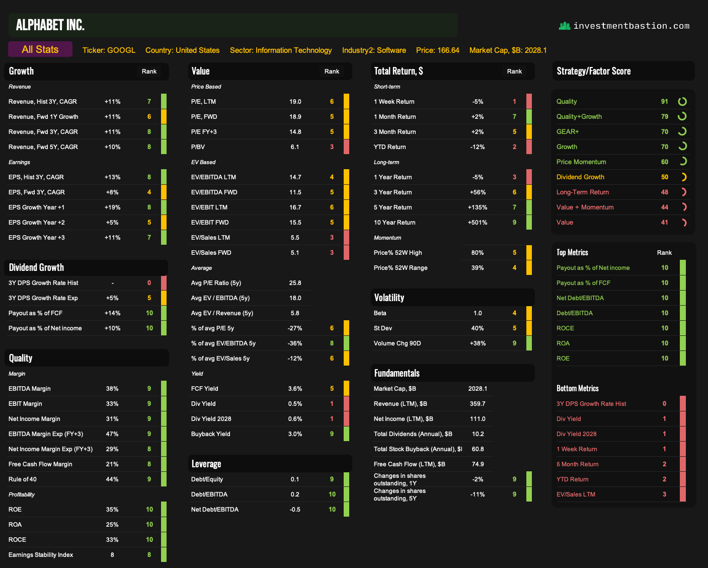
Alphabet — the cheapest stock in the group, with strong scores across all key growth and quality metrics.
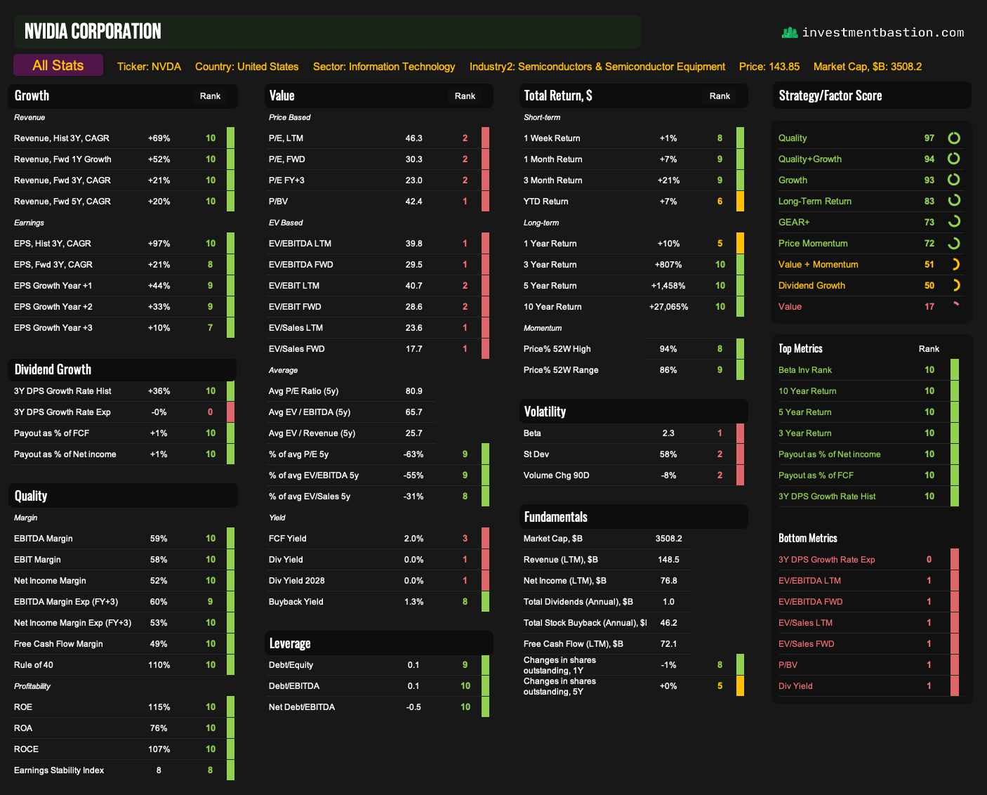
Nvidia — best-in-class Quality + Growth rating.
Amazon — relatively lower scores across key strategies compared to others on the list.

Tesla — valuation looks elevated relative to expected growth and current business efficiency.

Highlighting both quantitative ratios like ROE, P/E, FCF, and the importance of context (industry, macro, management) balances precision with flexibility. That blend of top‑down and bottom‑up perspective is exactly what separates a checklist from real analysis.