

👉🖥️ Bastion Excel Terminal
This guide introduces two visualisation tools — a Heatmap and a Scatterplot— designed to complement the Strategy Builder's core functionality.
While the Strategy Builder offers a comprehensive multi-factor dashboard to evaluate a broad universe of companies at once, Heatmap and Scatterplot allow for more focused, visual comparison:
Heatmap helps you compare many stocks based on a single metric.
Scatterplot allows you to compare several dozen stocks across two parameters.
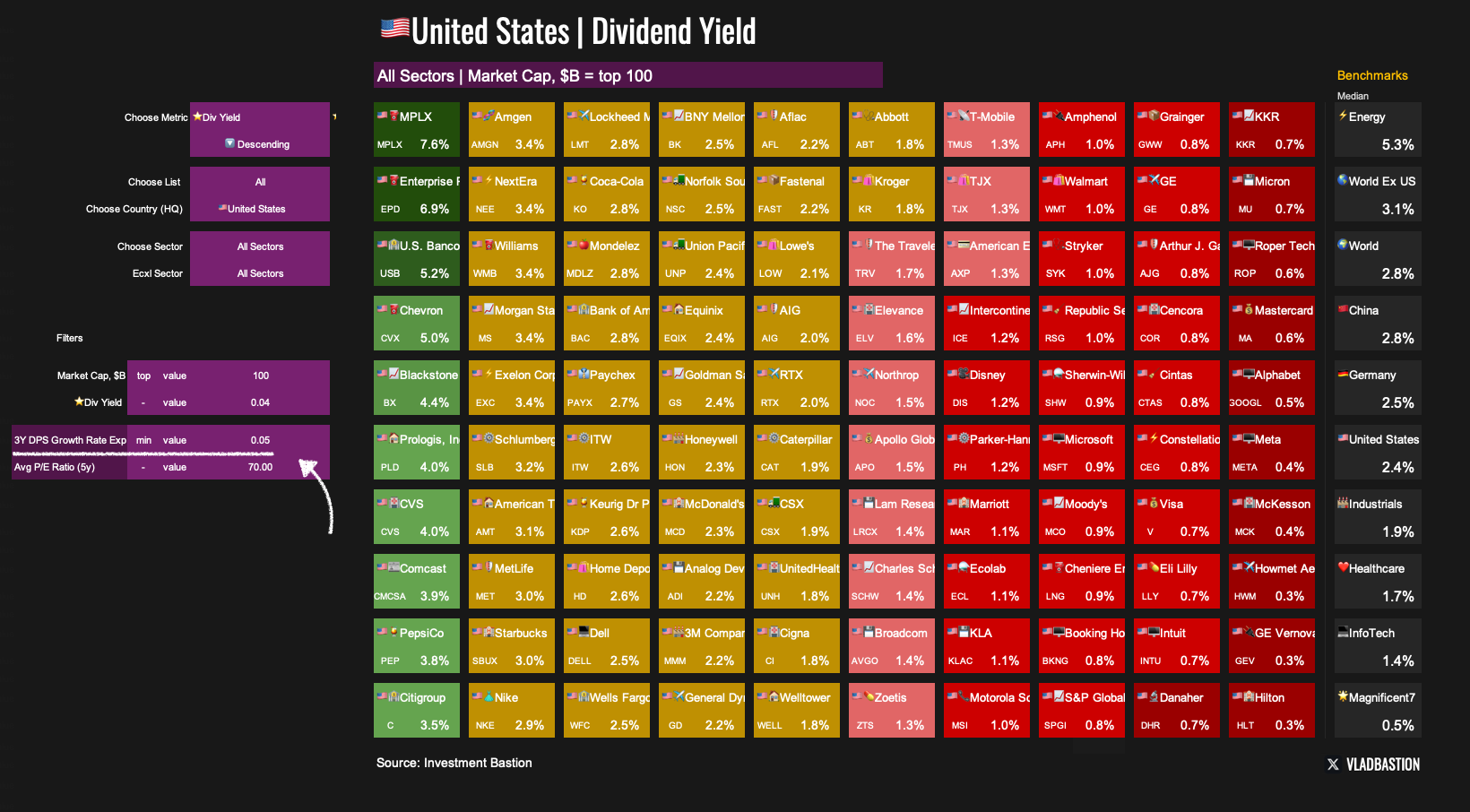
Heatmap: Compare Companies on a Single Metric

The Heatmap file is a table that lets you visually compare companies based on a selected financial or valuation metric.
Step 1: Choose Your Parameters

Metric: Pick from 50+ available metrics (e.g. Forward P/E, ROIC, Free Cash Flow Yield, etc.)
Universe: Select a list (S&P 500, Nasdaq 100, custom screeners, etc.)
Country: Filter by region (e.g. U.S., China, Europe)
Sector/Industry: Select broader sectors or narrow down to specific industries
Step 2: Apply Filters

To refine your table further, apply any combination of the following filters:
Market Cap Filter
By default, the top 100 companies by market cap are selected. You can customise this threshold as needed.
Metric Filter
Set a minimum or maximum value for the chosen metric.
Example: You want to see the top US companies by dividend yield. But the expected dividend yield should not be lower than 2%.

Additional Filters (2 optional)
Add conditions on other variables to narrow the selection further.
Example: You want to see the top US companies by dividend yield. But at the same time, the expected growth rate of their dividends should be no less than 5%.
What It’s For
The Heatmap isn't meant for making final investment decisions, but rather for:
Gaining a broad view of valuation or performance levels across the market
Generating ideas for deeper research
Scatterplot: Compare Companies on Two Dimensions
The Scatterplot lets you visualise companies on a two-axis chart, comparing them by two key metrics at once. It's an effective way to identify patterns, clusters, and outliers.
Step 1: Define Your Universe

List: Choose from preset lists (e.g., S&P 500, Dividend Aristocrats) or leave blank
Company Count: Automatically selects the largest by market cap
Country: Focus on specific markets
Sector: Include or exclude certain sectors
Step 2: Choose Your Metrics
Use custom metrics…

…or select from built-in presets, including:

Forward P/E vs Expected Revenue Growth
EV/Sales vs Rule of 40
Dividend Yield vs Revenue Growth
Revenue Growth vs EBIT Margin
3M Return vs 1Y Return
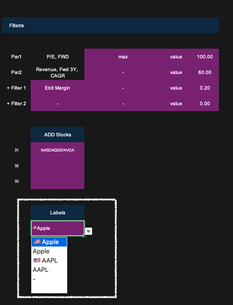
Step 3: Filter Outliers
Filter out extreme values (e.g. very high Forward P/E) that distort the visualisation.

Add additional conditions to refine your sample.

Example: You want to plot P/E vs Revenue Growth, but only for companies with EBIT Margin > 20%. The scatterplot will adjust accordingly.

Step 4: Add Stocks Manually
Use the Add Stocks feature to include specific tickers or names in the chart.
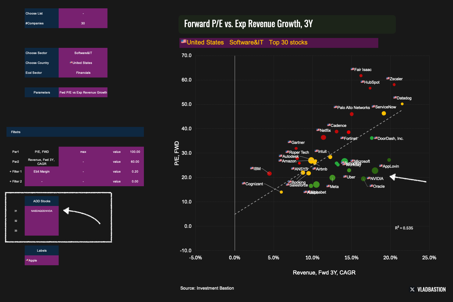
Step 5:Customize Labels
Choose how data points are labelled (e.g. ticker symbol, company name, market cap rank).
Why Are There 4 Chart Styles?
The same dataset is displayed using four chart templates, each with a different style. This is necessary because Excel doesn't support conditional formatting for scatterplots, so I’ve created four preset designs to ensure relevance depending on the use case.

Final Thoughts
Heatmap and Scatterplot aren't standalone investment decision tools. Instead, they are powerful complements to the Strategy Builder. They help you:
Get a visual feel for valuations and trends
Understand how companies compare within a sector or region
Spot outliers and generate new research ideas
In short, they expand your toolkit for efficient and insightful market analysis.
If you want access to these dashboards, subscribe below.
Other Guides: